We’re going to take a short break from my Comic-Con wrap-up for a quick little instructional post on how to make your own alphabet blocks. They’re just like regular alphabet blocks except they don’t necessarily have the alphabet on the face—but we’re still going to call them “alphabet blocks.” Basically, we’re going to be creating photo alphabet blocks, placing alphabet block-sized images on the face of each small wooden cube. Like a lot of my how-to posts I’m going to ramble for a bit about the motivation for creating custom alphabet blocks, so if you’re in a hurry, scroll down to the section titled “New and improved Mexican Loteria blocks.” Otherwise, read on and enjoy!
A little background
")
Arlene measures the value of her soul while listening to the insidious sounds of Musica de los Muertos — 2007
I’ve been using traditional children’s alphabet blocks in my photography for several years, dating back to around 2007, when I discovered that blocks would allow me to build more elaborate stages for my photos. Until that time, most of my work lived on a single horizontal plane atop the stacks of records that formed the physical base of each scene. Using blocks I could create tiers and steps, and better integrate the objects in the foreground with the vintage album covers in the back.
The blocks also allowed me to interject words and numbers into my compositions in a manner that stayed true to my vintage sensibilities. Like many of the toy figures that roam about my surreal constructions, alphabet blocks are objects that connect to past memories, and set the narrative in a familiar—yet unsettled—time period.

Money blocks!
The drawback of traditional alphabet blocks is that each set contains only 38 different characters (A-Z, 1-9, +, -, =). Sure, that’s plenty for creating words, numbers and equations, but I soon found the blocks somewhat limiting. My work relies quite heavily on symbolism and iconography to represent ideas in a much more interpretive way than the literal communication of letters and words. While working on my 2009 solo show Plastic Prophets of Vinyl Redemption I “invented” money blocks, which are nothing more than regular alphabet blocks wrapped with a piece of old-style U.S. currency like a little birthday present. A good example of money block use is seen below, with the blocks adding both compositional structure and narrative symbolism.

Mindy dreams of pearls and the envy of all the girls at Kappa Nu — 2008
My next foray into alphabet block customization came in 2010 as I was preparing new work for Seven Signs of the Kewpie Apocalypse. For this show I had it in my head that several pieces would benefit from alphabet blocks that looked like Mexican Loteria cards. Surely, such blocks must exist, or so I thought, for several reasons:
- Loteria images are everywhere! You can find them on greeting cards, matchbooks, cigarette cases, shopping bags, wallets, pendants, mouse pads, and beaded curtains.
- There’s no possible way that I’m the first person in all the world to have thought that Loteria images should be on alphabet blocks.
- They simply should exist because the idea of stackable Loteria blocks is just too cool!
Nope. I searched and searched, along the way finding alphabet blocks for languages across the globe from China to Egypt, but nothing that even remotely resembled what I was envisioning for my new photos. So I made my own.
A little history for those unfamiliar with Loteria cards
 Loteria is a bingo-like game played by matching colorful images selected from a deck of cards with identical images on a player’s game board. It’s a simple but entertaining game, largely because of the wonderful pictures of people and things such as the sun, the moon, the devil, and the human heart. The images that most people associate with Loteria were created by Don Clemente Jacques in 1887, which continue to be produced to this day.
Mexican Loteria blocks — the early years
My first attempt at creating Loteria blocks was mildly successful, but not particularly satisfying. Having a nice deck of Loteria cards I simply scanned the card faces as high quality TIFF files, arranged the images into a document as one might envision the faces of a cube unfolded to lay flat, printed, then wrapped the paper around a normal alphabet block as I’d done previously to create money blocks.

Yeah, I guess they look okay, but the images are only so sharp, the colors are rather dull, and the folded end flaps were too thick and bulky, so you couldn’t really stack the blocks without first setting them beneath heavy books for a few hours to coax the paper flaps to lay flat. You also see only one image on each block, as I never could quite get the dimensions right to center images on every side of the block (and forget about the top or bottom flaps). Still, I used them for the photos in the exhibit with reasonable success.

Seven Signs of the Kewpie Apocalypse — 2010
Which brings us to the present day.
New and improved Mexican Loteria blocks!
Always looking to improve the look of my photos, I recently set out to create my own custom Loteria blocks that would improve upon the quick’n’dirty paper-fold blocks I’d previously produced. To this end, the blocks needed to be:
- Colorful!
- Sharp!
- Printed on all 6 sides!
- Easily stackable!
Rather than wrap traditional blocks with paper, I decided that a better solution would be to either apply or transfer existing Loteria images directly onto blank wooden blocks. I’d attempted photo transfers onto wood in the past, but had been less than happy with the results. DIY photo transfers are great if you’re willing to sacrifice a little bit of clarity and accept some distress to the image as you peel away layers of the transfer material. I’m not one to generally sacrifice or accept quality—unless that’s exactly what I want, and in this case, it was not. So, for this project, I’d be applying existing Loteria images directly onto the face of blank wooden blocks using decoupage.
Step one — Preparing the images
Finding Loteria images that would fit onto the face of an alphabet-size block was not as difficult as I’d imagined. Pasatiempos Gallo makes a set of mini Loteria games that are intended to be tucked as prizes inside a piñata. The whole game—cards and boards—is printed on a single sheet of perforated light cardboard that is folded up to fit inside a playing card-size plastic wrap. Perfect! Though the cards were too large to fit on the side of an alphabet block, the images on the game boards were juuuuust right! Using a pair of scissors, I cut out each image, trimming to just outside the black line that borders each colorful illustration, effectively creating a deck of super mini Loteria cards

Trimming images from the mini Loteria game boards
Note on the printing process!
The Loteria images used for this project were professionally printed, likely using an offset printing process. If you consider using this same process for your own photos or images you will want to make sure that the images are similarly printed using either a laser printer or professional printing equipment other than ink jet. The process of applying the image to another surface involves the use of goopy liquids that may cause standard inks (even when dry) to blur or smear. Be forewarned!
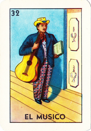
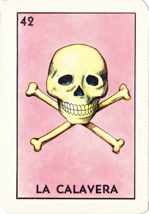
Traditional Loteria sets include 54 different images. Unfortunately, the mini game includes only 36, choosing to leave out 18 “less essential” images such as La Botella, El Arpa, and La Maceta (the bottle, harp, and pot, respectively). At first, this caused me no special grief… until I realized that La Calavera (The Skull) and El Musico (The Musician) were not included in the set. Oh, sadness.
Step two — Preparing the blocks
Alphabet blocks come in all sizes, depending on the manufacturer. The alphabet blocks you see in my photos are produced by Melissa & Doug. They are really great blocks measuring 1 and 3/16ths of an inch on each side. There are a number of manufacturers of plain, unpainted blocks around the country, but the precise dimensions used by Melissa & Doug eluded me. For this project I chose 1 and 1/4 inch blocks from Barclay Wood Toys and Blocks located in Hebron, Indiana. Their blocks are made of kiln dried hardwoods (maple, birch, ash, etc) and at a cost of 16 cents per block I bought 16 for about $12 (including postage). Since there were 36 different Loteria images and I wanted to place a different illustration on each side of my blocks, I’d need to make six blocks (leaving ten for mistakes, er, future custom blocks.
I wanted my new and improved blocks to somewhat resemble the blocks I’d made using the paper wrapping method, so I made the decision to place the Loteria images on clean, white backgrounds—kind of replicating the white backgrounds of traditional alphabet blocks (though without the colored edge borders). A different approach would have been to stain the blocks to give them an old world feel, and while I think that would have looked spectacular, the white backgrounds would provide greater image contrast when incorporated into my work.

First coat applied to the unfinished wooden blocks
I applied two coats of white enamel spray paint to the blocks, placing each atop a quarter to prevent the painted blocks from sticking to the newspaper drop cloths.
Step three — Organizing the images
Didn’t we already prepare the images? Yes! But now we are organizing the images. Remember, my intention was to use these custom blocks in my photos, and how calamitous would it be to be in the midst of composing a scene and discover that El Diablito (The Devil) was on the same block as El Alacran (The Scorpion)? Horrors!
I divided my mini images into six groups—one per block—making sure that there would be a good distribution of illustration themes and colors from one block to the next. So, for example, a single block might have one side depicting a person, another with a celestial body, another with something that grows, etc. I also used this time to plan the orientation of each image on each block. There really aren’t any hard and fast rules here, but have you ever looked at a drawing or painting of a pair of dice and had the feeling that something is wrong? That usually happens when the artist mixes up the number of dots that should appear on each face—i.e. one is next to six, three is next to four, two is next to five—combinations that won’t be found on a real die.

‘A’ is for apple…
The same holds true with alphabet blocks where, generally, the painted letter on the front of a block will be right-side up, with the letter on the opposite face will be upside down. Likewise, the outlined letters, numbers and illustrations on the unpainted sides (those that wrap all the way around the block between the painted sides) are flipped 90° from the main letters on the painted faces. (Go ahead, if you have some blocks handy, check it out.)
In any case, decide on a strategy for how your images will be oriented on the faces of your blocks. In my case, I decided that images on opposite sides of a block would be vertically flipped (like on traditional alphabet blocks). Images on adjacent blocks would be flipped 90°, so no two touching faces would ever have the images oriented in the same direction. I did this, again, to provide greater contrast for the image that would be facing the camera.
Organizing the images might not sound important, but will save steps later on when you discover that an image 30 seconds from drying solid has been affixed to the block upside down.
Step four — Attaching images to the blocks
With the paint dry we’re finally ready to attach images to the sides of our custom alphabet blocks! If you’ve ever decoupaged, this part is super easy. Of course, prior to this project, I had never decoupaged… and it was still easy!
I used Mod Podge to affix the mini Loteria images to the sides of my painted blocks. Mod Podge is, basically, a bunch of goo that acts as a glue, finish and sealer, that comes in all kinds of “flavors” such as matte, gloss, and sparkle (and probably a lot more based on the dizzying array of bottles I found at my local craft store). I chose Gloss Lustre. I also chose a container with a flip-top drip applicator, as I didn’t anticipate the need for a whole lot of Mod Podge. For larger projects you may want to get a big ol’ vat of Mod Podge and a paint brush to slop on your glue and sealant.
Attaching an image to a wood surface is a two step process:
The Glue Step
- Place a few drops of Mod Podge on the surface of a block.
- Spread the goo over the surface using a foam brush (or a paintbrush), thoroughly covering any area where you plan on attaching the image.
- Place the image face down on your workspace, and place a couple of drops of Mod Podge on the back of the image.
- Once again, spread that goo around, making sure that you brush the goo up to and over the edge of the image.
- Take the now gooey image and place it—face up, of course—on the equally gooey surface of the block. The image is going to slip and slide a bit, which is actually to your advantage as you can slip and slide it right into place at the very center of the alphabet block. I actually used the backside of a fork for this task, as the width of the fork was a little narrower than the height of the mini Loteria images, so I could easily eyeball the horizontal and vertical center points of my blocks.
- You want to make sure that every little piece of the image is well attached to the underlying block, and that evil air bubbles get squeezed out from beneath the commingling layers of goo. How? Oh, I suppose you could use a fancy rubber roller for this kind of job. I used the fork from step 5, rocking it back and forth to firmly seat the center of the image and squeeze out bubbles. I then ran the rounded edge of the tines along the perimeter of the image to squeeze out excess goo and make sure every edge and corner was firmly affixed to the block.
- Wait 15 or 20 minutes for the Mod Podge to dry. You can pass the time by reading my blog or by cleaning your brush using ordinary tap water.
Note!
Remember that Mod Podge is a glue, and though it is water soluble (to a point), your brushes will be very unhappy if they are allowed to dry solid in a coat of Mod Podge goo!
The Sealing Step
Once the first application of Mod Podge has dried, you seal and finish the now glued-on image with a second application of Mod Podge. Yes, the same Mod Podge. Remember, it’s a glue and sealer all in one!
- Place a few drops of Mod Podge on the surface of your image.
- Spread the goo over the image surface, making sure of three very important things:
- Cover the entire surface, spreading beyond the edges and corners.
- Brush as smoothly as possible (which is why a foam brush is recommended).
- Brush in one direction.
- That’s it!
Allow 15 to 20 minutes for the sealant coat to dry—perfectly clear!—and one face of the alphabet block is finished.
For the Loteria blocks I worked on all six at the same time, basically doing the primary (i.e. the coolest) image for each block first, then rotating to an adjacent side to affix that image, and so forth until all six sides were complete.
The results?

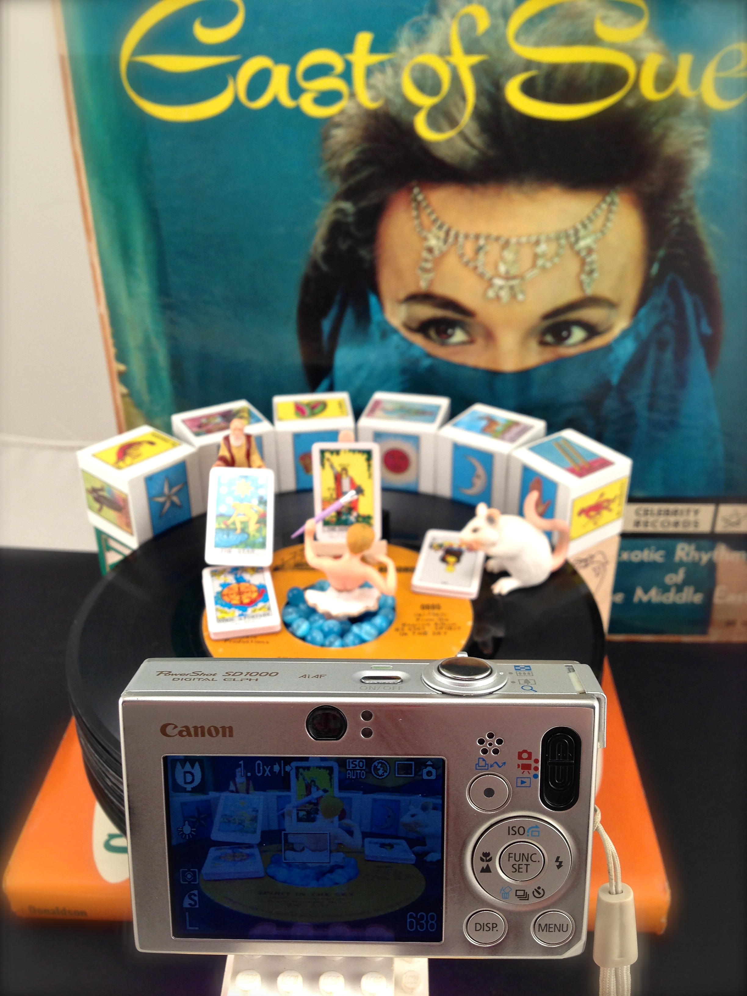
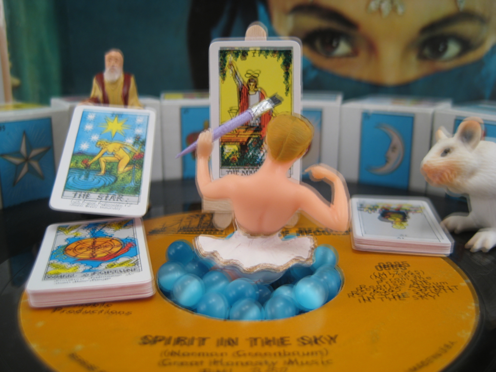
My set of six finished Loteria blocks!
I’m incredibly happy with the way my blocks came out and I can’t wait to begin using them in upcoming photos! Next—and since I still have 10 unused blank blocks—I think I’ll begin brainstorming future custom alphabet blocks. Famous authors? Notable scientists? Tarot cards? What do you think, Patient Reader; any suggestions?
Read Full Post »


")