It’s been quite a while since I last wrote a post on how I go about photographing and creating some of the images you’ll find on my web site, and with the release of a brand new limited edition print imminent I thought I’d chime in on some of the behind the scene shenanigans that went into the creation of that image — She who creates Good Fortune.
Preliminary Stuff
The concept behind this photo would be the coming into being of an entity that was responsible for bringing Fate to the world through the creation of tarot cards. I envisioned an artist standing at an easel painting cards one at a time, with a stack of blank cards on one side and finished cards on the other. Surrounding the figures would be elements representing other celestial and mystical realms, while in the background an even higher mystical figure would look on.
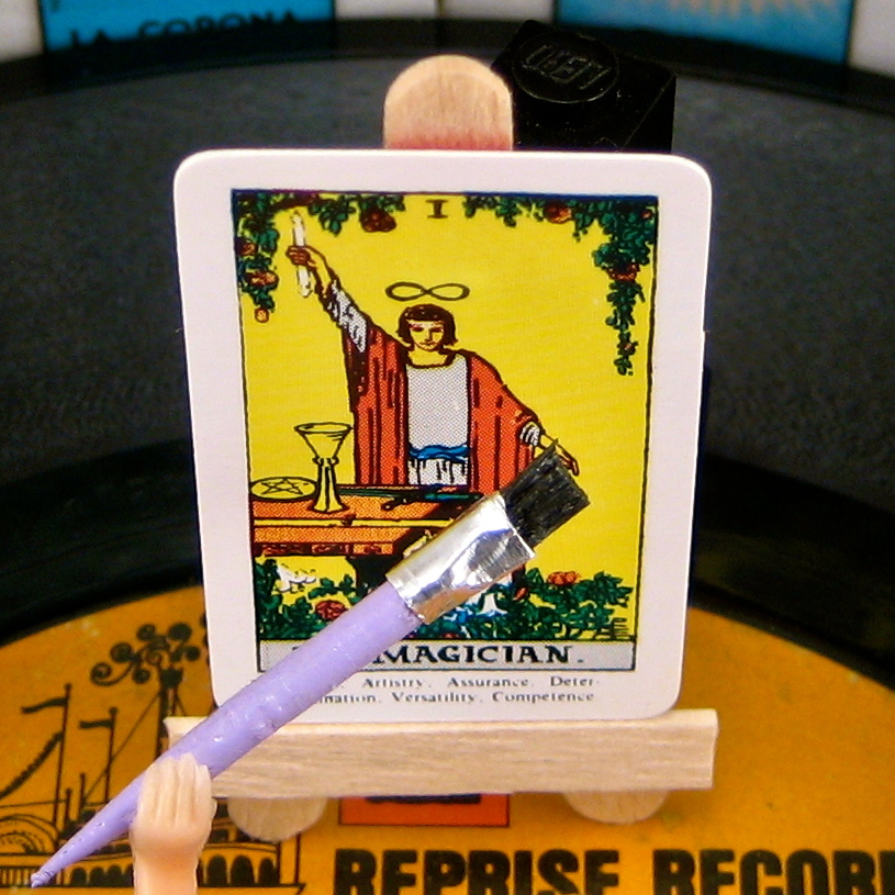 Playing the role of “artist” at the center of the new composition would be a figure I frequently refer to as “Marilyn”, solely because she is blonde and has a billowy dress. She was produced by the Marx Toy Company in a set of scantily clad figures known as “Louis’s Beauties”. Her pose, with one hand stretching forward and the other curved inward, would be perfect — so long as I could place a tiny paintbrush in her hand and set a “canvas” before her on an easel. And that’s what you see to the right. I fashioned an easel from wooden coffee stirrers (propped up by undetected Legos), while the paintbrush was made from the end of a toothpick and a skinny strip of aluminum foil wrapped around the snipped ends of an actual paintbrush.
The Photo Shoot
Over the past couple of years my process has become increasingly complex, with elaborate stage sets, and images that are sandwiched together from multiple focus layers (see a past post on the subject of creating focus stacks). Seriously, some of my photos take a month or more to produce. So, in preparing work for my 2013 summer show I decided to go “back to basics” for a set of simple landscape image: one record cover, one stack of 45’s, a primary figure, and maybe a couple of additional figures in the background. Deep focus? Forget it; I wanted the focus to only be on a single character emerging from the center of a record, and the rest of the image could be blurry — like real professional photography!
For these photos I put away my DSLR and my nice L-series lens, and instead chose to use my “walking around” camera — a compact little Canon SD-1000 Elf with a built-in digital macro setting that would be perfect for getting up close and personal with the characters I wanted to highlight. I shot brides and grooms, belly dancers, religious icons, and all sorts of figures — all from a few inches away with a very shallow depth of field (focal length 5.8mm, aperture f/2.8). I was able to take each of these photos fairly quickly, spending not much more than a day or so shooting and adjusting the finished image, while retaining the conceptual and symbolic elements of my more elaborate images.
Staging for She who creates Good Fortune
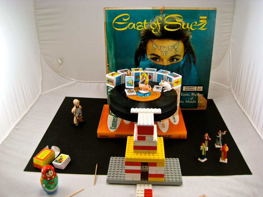
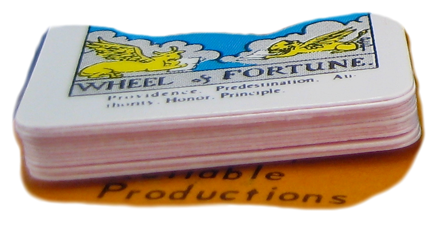
Above, you see the final staging for She who creates Good Fortune. Very simple. An album cover in the background, a stack of records in the foreground (actually balanced atop alphabet blocks in addition to the book you see), and a handful of objects used to tell the story. The whole scene, from back to front, is about 8 inches deep, with the dancer emerging from the stack of records about 4½ inches from the back. In front of everything is a crude tripod I built out of Legos to compose my shot and hold the camera steady.
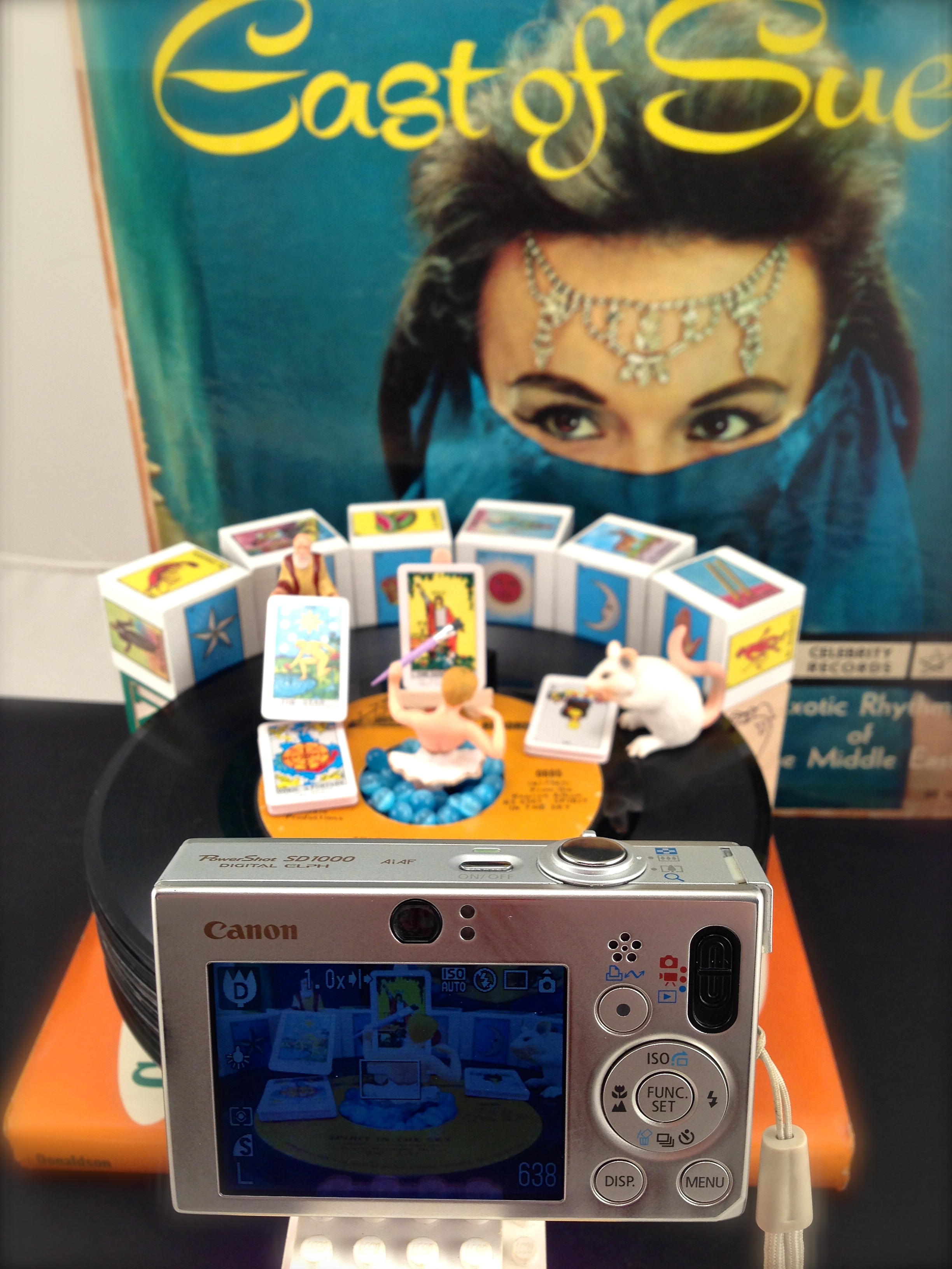 As you can see in the photo on the left, the camera sits only a few inches from the action. Given the tight focal length and relatively large aperture, the depth of field is going to be very shallow — exactly what I was seeking to accomplish with this series of macro landscapes. Except…
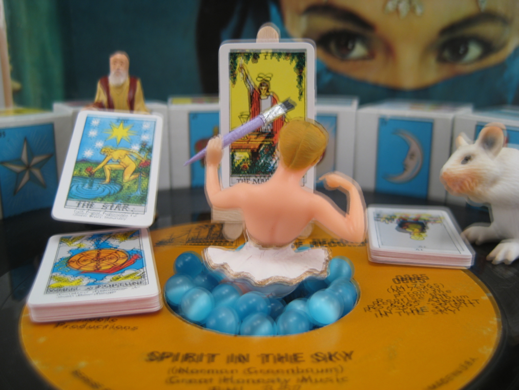
For this particular photo that wasn’t what I wanted. Focusing on the artist in the center of the record brought her nicely into focus, but left the card she was painting — and even the paintbrush! — out of focus. Likewise, the card being laid down and the mouse were fuzzy, and I felt those elements of the image were just as important (symbolically) as the artist at the center.
So, it was back to my deep focus trick to mask out and combine the in-focus elements from multiple photos to construct a single image. Luckily, for this photo, I’d only have to worry about two images: one that held the foreground in focus and one that held the background in focus (or, actually, just the two farthest tarot cards — the album cover and Loteria blocks could remain out of focus). Easy, right?
Nope.
Take a look at the two photos below: one focused at the center of the artist’s back, the other focused on the tarot card she is painting. Apart from the shifting of focus from the area around the artist to the area just beyond the artist, notice anything slightly peculiar?
My deep focus trick relies on overlaying portions of one photo on top of another — provided all the photos are taken from exactly the same vantage point, something my professional tripod does quite well. A tripod made of Legos… not so much. So what you see above is a slight shift in vantage point as I moved the camera to alter the focus. And that means this when the two photos are laid one atop the other:
Foreground and background overlay — click to view larger image
Well now, THAT doesn’t look very good, does it?
What should have been an easy task of masking out the in-focus elements of the foreground and layering them over the background in one convenient step became a lot more challenging. If you look carefully at the image above you’ll see that the “difference ” (for lack of a better word) between the two images is not merely a simple (x,y) shift of a few pixels. The perspective has actually changed from one image to the next, though not a lot. Want some proof? Take a look at an actual size closeup of the overlay on the left side of the record label:
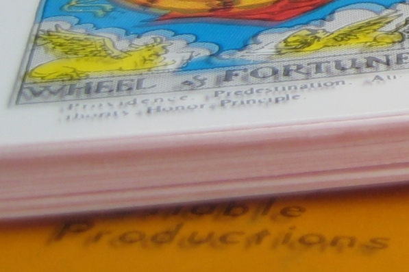
Photo overlay — left side detail
Note the position of each character in the word “Productions” from one image to the other. The base of the “P” is off by a little, with the better focused image a little higher and shifted a bit to the right. By the time you get to the “n” and the “s”, what had been a little change is noticeably larger. And if you scan all the way over to the right side of the record label…
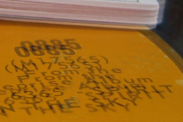
Photo overlay — right side detail
Yikes! the difference is now very, very noticeable! So much for my plan to simply place pieces of the foreground over the background.
The solution?
Forcing square pegs into round holes
Yep, that’s pretty much what I had to do. Upon closely examining the foreground image I identified nine areas that could be carefully masked out and placed on top of the background, as you can see in the animation below (you can read about how to create brushed masked layers using Apple’s Aperture software here):
Note that most of the masked layers have been carefully shaped to completely encircle a given region (say, text on the label) with the perimeter of the “puzzle piece” falling on an area of uniform color and texture, such as the brownish-orange of the record label. By creating the layers in this way, and feathering the edges, it became much easier to blend the top layer into the image beneath. In some cases (such as with the Wheel Of Fortune region, below), this wasn’t possible, and the puzzle piece had to cut through a “solid” object. Even in these cases, however, you’ll notice that the edge remains — as much as possible — within uniform regions of the masked layer (as below, across the field of blue on the tarot card).
Wheel of Fortune layer (detail)
Once all of the layers had been masked and output as transparent TIFFs, assembling the final image became an exercise of dropping puzzle pieces over the background and scooting them around until each was aligned (as closely as possible) with the background. The animation below illustrates how this was done for the text on the right side of the label, first moving it horizontally and vertically, then rotating the image ever so slightly to compensate for the change in perspective from one photo to the next (eyeballing the alignment, of course).
Note:
I also had to slightly resize the layered image to match the height and width of the text in the underlying background. Because these photos were macro shots, the slightest difference in distance (and angle) of the lens to the objects from one photo to the next resulted in similar differences in what was captured by the camera. So, where the width of the phrase “IN THE SKY” might be w in the background photo, it might be w’ in the foreground photo requiring that the dimensions of layered “puzzle piece” be changed to match what it would be correcting. Optics! Cool! (Or not so cool…)
All told I created nine separate foreground layers to assemble the final image and achieve the look I had been seeking. To finish off the piece, I selectively erased some of the background yellow on the tarot card being “painted” to create the illusion of the artist adding the finishing touches on a new card of Good Fortune. Likewise, the surface of the card on the right was erased to give the appearance of a stack of blank cards waiting to be brought to life.
Yes, it was a lot more effort than I’d been anticipating, but I was more than happy with the results, and She who creates Good Fortune was one of the best received images in my summer solo show.
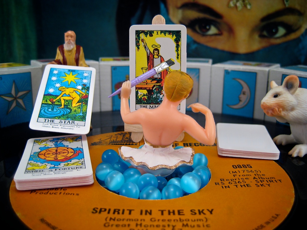
She who creates Good Fortune


